These notes will
discuss how a critical and theoretical background informs
and relates to my studio practice. This background is broadly
concerned with issues of abstraction and representation in
painting. I am concerned by questions about the rhetoric of
painterly pictorial structures, painting as a specific medium,
the history of its transformations and its polemical positions.
An important and recurrent theme will be the relationship
between cultural hegemony and painterly abstraction in terms
of questions of signification.
I would like to point out however, that this theoretical and
critical background is not demonstrated by the paintings.
It is literally a background to the making of the work where
a series of propositions set up a critical dialogue. Much
of the logic of the painterly strategies at work in my recent
painting can be traced back to the early 1990s so I will give
an overview of these sources before entering into an account
of more recent work.
Closer Than You Think
Between 1994 and 1996 I made a series of paintings entitled
Closer Than You Think. This series was set against
a particular critical perspective about questions of painting
and medium within a more general cultural and historical context
characterised by issues of hegemony. The discursive focus
for this was the critical polemic between Clement Greenberg’s
high modernity and Minimalism, particularly in terms of the
work and writings of Robert Morris and Donald Judd. As Michael
Fried has pointed out, Minimalism was in many ways the logical
conclusion of much of Greenberg’s thinking (1). Morris
and Judd found the weaknesses in Greenberg’s ideas about
medium and a pictorial condition. With relative ease they
were able to undermine what some would see as Greenberg’s
conservative idea of painting. In turn they constructed another
formal position around a categorical hybrid of the art object
which was “not painting, nor sculpture” but specific
objects (2).
The polemic here was between a reductive dynamic in Greenberg’s
thinking around an absolute and specific idea of medium, which
was in contrast to the expanded, and relational idea of the
art object and its context in Minimalism. This moment in the
history of the Modernist avant-garde seemed to me to be crucial
when thinking about painting within a contemporary context.
Minimalism not only delivered a decisive blow to painting’s
previous centrality in the Modernist project but also determined
the basis for an artistic practice within an expanded field
rather than in terms of a specific medium. In addition to
this, Judd made a distinction between the American and European
context. The part-by-part functioning of compositional works
of art he saw as being an ‘objectionable European relic’
(3). In contrast he saw the best recent American art as being
characteristically non-compositional, externalising, relational
and dynamic. This contrast between the internalised/compositional
and externalised/non-compositional qualities led Morris to
develop his ideas around a perceptual relationship to shape.
By applying the distinction between composition and non-composition
one stage further, Morris arrived at a distinction between
complex and unitary forms. A complex form required that the
spectator disassemble it and understand it in terms of its
parts. The spectator’s understanding of simple or unitary
form is, in contrast, immediate being driven by the form’s
gestalt and requires no such part-by-part reading. This gestalt
effect for Morris is what he understood as being the motor
pushing the spectator’s reception of the work within
a situation. To compound this quality, Minimalist art tended
to be organised, exhibited and installed around grid-layouts
prompting an a priori reading of the work by the spectator.
The resulting installation can be thought of as a ‘situation’;
a totalising work that even includes the spectator.
The issues in this debate seems to me to be crucial in terms
of a contemporary condition of painting and they unusually
came together when I saw a billboard advert for Euro Disney
in 1994 at the entrance to the Eurostar terminal in Waterloo
Station in London and a parallel poster campaign in the London
Underground stations (see illustration 1).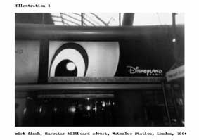
The visual motif
for the each poster was a fragment of a Disney cartoon character.
For the Eurostar poster this was the eye of Mickey Mouse (his
ears were used for the Underground posters). The Eurostar
poster neatly doubled as an image of a tunnel as well as of
Mickey Mouse. What struck me with this image was how efficient
the Mickey image was as a graphic gestalt. A mere portion
of the image was enough to evoke, instantly, the total identity
of the image. Moreover, the poster’s slogan, ‘The
Magic is Closer Than You Think’ reinforced the sense
of the automatic working of the image’s gestalt switching
between a fragment and a reading of it in terms of its identity.
The cunning structure of this publicity image brought into
focus for me one of the paradoxes of the Minimalist project.
That its relational objectives and its structural use of gestalt
forms corresponds in many ways with a cultural and communicational
model of visual form that can be seen to be very much at work,
all be it insidiously, in the Disney campaign described here.
Gestalt forms are the stock in trade for billboard and poster
campaigns and the Disney/Euorstar campaign is an excellent
example of their application.
The link here is in the use of gestalt qualities to bring
to rise in the spectator or passant an instantaneous
familiarity with a sense of the object’s identity as
a whole, this mechanism literally happening in a way that
could be described as being ‘closer than you think.
The Disney campaign’s slogan, ‘The Magic is Closer
Than You Think’ also shadows Robert Morris’s comments;
“One sees and immediately ‘believes’ that
the pattern in one’s mind corresponds to the existential
fact of the object”. (4)
My practice used this conjunction as a pretext for a group
of paintings that used both the visual syntax of the Disney
adverts and a rhetoric of painterly abstraction. Grids, framing
devices, dripping and gestures were all used in conjunction
with fragments of the Mickey Mouse image. What had struck
me in the Disney adverts was how efficient they were as gestalts.
With very little visual information the whole image could
be decrypted suggesting that Mickey was a highly pervasive
image if not a ‘unitary form’. I laid the fragmented
Mickey image into grid systems, used it as a repetitive motif
and stencilled and imprinted it into painterly grounds. Networks
of paint drips were used to mask and uncover these images
within a regime of visibility and invisibility. The aim here
was to use painting’s rhetorical history and syntax
as an intervention within its critical demise as a medium.
This was not so much to make a case for painting but more
to recuperate and assert its critical specificity. The paintings
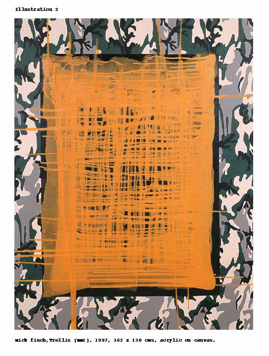
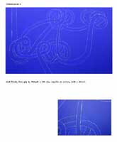
in this series explored a very distinct objective. Trellis
(MM1) (see illustration 2) used camouflage as a border
within which a thick painted ground had a Mickey Mouse image
repeatedly imprinted into it.
Paint was systematically
dripped from each side converging in the central ground and
revealing the imprinted images as well as creating a drip
grid network. The camouflage was a motif called ‘Trellis’
which was used by the US army in the Vietnam war. The syntax
of the imagery here was very specific. Camouflage painted
onto the canvas functions much like Jasper Johns’ targets
or flags. As a token image it confounds a straight forward
reading; it functions equally as camouflage as well as a reference
to or a representation of camouflage. Similarly the imprints
of Mickey Mouse’s head (from a Mickey Mouse shaped box)
were an indexical deployment of the image. The intention here
was to situate the spectator within the material address of
the painting, where dripping, and a range of mark making drew
in and compelled the viewer to make a reading of the work.
At the same time a layer of associations generates a field
of references and signification. With a work like Trellis
(MM1), a syntax of painterly abstraction was brought
to bear upon forms strongly associated with American culture
and questions of hegemony. Such references were made consciously
and related in many ways to some of the issues of US cultural
hegemony raised by Serge Guilbaut (5) and Yve-Alain Bois (6)
which I will expand upon in the next section. What was as
interesting for me with Trellis (MM1) and other paintings
from this series was how a structuring of visible and invisible
qualities can be read across a cultural axis and not just
as a phenomenological reading of the invisible/visible in
terms of presence/absence, which is so often the case with
painterly abstraction. This brings to mind for me one of the
key critiques of humanist culture, Louis Althusser’s
‘Ideology and Ideological State Apparatuses’.
(7) When the ideological emphasis of institutions are rendered
invisible and are naturalised into an ’obviousness’.
As Althusser says:
“Like all obviousnesses, including those that make a
word ‘name a thing’ or ‘have a meaning’
(therefore including the obviousness of the ‘transparency’
of language’), the ‘obviousness’ that you
and I are subjects – and that that does not cause any
problems –is an ideological effect, the elementary ideological
effect. It is indeed a peculiarity of ideology that it imposes
(without appearing to do so , since these are ‘obviousnesses’)
obviousnesses as obviousnesses, which we cannot fail to recognize
…….” (8)
The tension between the invisible and the visible in Trellis
(mm1) produced an insidious reading; something hidden
and material at work within the representation transforming
merely incipient elements into something apparently subject
to ideological effects. The objective throughout the Closer
Than You Think series was to situate the spectator within
a painterly strategy whereby vigilance and interrogation of
the painterly scene is essential. (9). The emphasis was upon
painterly syntax and rhetoric combined with culturally specific
material that is embedded into the structure of the tableaux.
Some Notes on Painterly Rhetoric and Syntax
There have been some key theoretical strata that have developed
out of Closer Than You Think into my present work. Before
discussing my next stage I’d like to map out these preoccupations.
The Beholder Discourse
I believe this term was first coined by Art and Language.
It refers to Michael Fried’s notorious essay ‘Art
and Objecthood’ (10). This essay is complex and
has fuelled a series of debates since it was published in
1967. Indeed I think there is much in this essay that can
be disputed, especially in terms of how Fried fought the corner
of High Modernist painting and sculpture. However the key
critique here of Minimalism as being theatrical and that somehow
painting has the potential to be anti-theatrical is a crucial
line of thought for me and will be easily discerned from my
account of the Closer Than You Think series in its
polemical relationship to Minimalism.
Theatricality for Fried is a very precise term and is derived
from his work on Diderot’s critiques of painting (11).
For him it refers to that which exists between mediums and
where the space of the work of art and the beholder is combined
or perhaps, or more importantly, is confused. As a critique
of Minimalism, theatricality was crucial for Fried. In Absorption
and Theatricality: Painter and Beholder in the Age of Diderot
(12). Fried looked further into terms which could counter
theatricality. In 18th century painting, the term theatricality
could be applied to those figures within a pictorial composition
that directly address our space or the presence of a would-be
beholder. The painting thus presents itself not as a painting
but as a continuum of the beholder's space. It is making a
statement addressing the beholder as if to say, 'I am not
a work of art, but like you I am real '. Absorption on the
other hand depends upon what is depicted not addressing the
viewer in this way. The scene and characters depicted are
'absorbed' within their own world-view and time. The viewer
thus has to negotiate the picture primarily as a work of art
that is removed from the space of the beholder, or more specifically
as a representation and not as something literal and 'real'.
Absorption in this historical sense depends upon an internal
mechanism of painting that can be seen as an internal tension.
For the painting has to simultaneously maintain itself materially
as a painting while presenting a pictorial schema. This can
be described as the viewer having to reconcile the work objectively
and subjectively, as he or she encounters both its status
as a work of art and its potential function as an image. Fried's
description of 'absorption' in terms of 18th century painting
did not serve his argument in Art and Objecthood . It also
conflicted with his assertion of the strength of the painting
he was supporting in 1967. It also fed the attack that Minimalism
was mounting upon painting. Pictorial schema in 18th century
painting brought with it illusionism, through perspectival
space, as well mimeticism. These were aspects that fell outside
the canon of high-modernist abstraction. The survival of painting
after Minimalism could be accounted for, however, in terms
of the capacity it has to engage the spectator within an oscillation
of forces much like those set out as 'absorption' by Fried
Parallax
Yve-Alain Bois’ essay 'A Picturesque Stroll Around
Clara-Clara' (13) mapped another relationship to the
‘totalising’ tendencies of post-war minimalist
practice. Robert Smithson made the comment that the famous
arial photograph of his Spiral Jetty is a ‘journalistic
gestalt’ which further more is at odds with the key
objective of the work; to situate the beholder within an ever
shifting scene. The intention was always that the jetty be
a promenade. Bois accounts for this assimilation, by the beholder,
of a shifting scene in terms of parallax effects where the
perception of an object is dependent upon and relative to
the position of the spectator. Bois then expands upon this
in relation to Richard Serra’s intentions for his monumental
work Clara-Clara . The inclination of the two vast sheets
of steel produced a play of parallax effects so that the spectator
can never envisage or maintain a comprehensive sense of the
work’s totality. In these terms Clara-Clara can be described
as a sculpture that works against gestalt effects
The beholder has to empirically assimilate what is before
him as the sculpture’s effects cannot be determined
a priori, as a thing-in-itself. Bois develops this reading
further as an application of the picturesque. Quoting René-Louis
de Girardin, Bois says,
‘For the picturesque is above all a struggle against
the reduction “of all terrains to the flatness of a
sheet of paper”…’(14) Thus, as with absorption
and anti-theatricality, parallax effects and the picturesque
can be seen as being rhetorical devices that are at odds with
the a priori effects of the gestalt mechanisms of minimalism.
The relationship with the picturesque will be developed later.
Flatness and Thickness
One example of what Yve-Alain Bois refers to as the two formalisms,
is the way ideas of medium specificity within painting were
developed in the USA and in Europe both through artistic practice
as well as within a theoretical and critical field. Greenberg
privileged flatness and opticality as being painting’s
specificity and this has served as a dominant discourse until
relatively recently. There is a French alternative, if not
a counter discourse which considers painting in terms of another
category, the tableaux, a complex term that is not quite so
present in anglo-saxon thinking. The distinction here is how,
in a French context, ‘thickness’ is privileged
as the key specificity of painting. Hubert Damisch has developed
this idea in many ways and his thinking can be seen as an
alternative to Greenberg’s position. His description
of Dubuffet’s Dessous la Capitale is a development
of thickness as a key concept:
"Such a programme supposes that all the means employed
in the making of a tableau remain apparent and that the painter
sacrifices nothing to a quest for effect, which always implies
some idea of dissimulation or surprise. All the same Dubuffet
recognized here not only a moral imperative but, very concretely,
the principle of an aesthetic. For this painter took on board
the whole area that painting worked hard at keeping secret,
starting with the under layers in which it is so rich. If
Dubuffet did not appreciate working in flat planes, it is
because the observer of Dessous la Capitale and the
geologist he became after that, liked working in the thickness
of the ground - I mean of the tableau - to reveal what is
beneath: scratching the paper, incising and beating up substance,
skinning it and whipping it up to reveal layers below, all
this gave him intense satisfaction and the reference to him
as bringing alive the landscape (metre le paysage "à
vif") was not simply a nice image. But what does that
mean? Would Dubuffet in turn succumb to the illusion of other
worlds? Isn't he satisfied having attained the foundations,
'e fond', rock bottom? Does he have to dig deeper still -
beneath the ground to the sous-sol, under the ground?"
(15)
Thickness here really does open up the possibilities for thinking
through painting - the notion of work in relation to the surface
adds up to an idea of excavation of the tableau as well as
of the painting. Damisch's reference to the ‘geologist’
that Dubuffet was to become, is an early echo of the sense
of what the surface of painting, epistemologically and as
the objet de connaissance, was to become for many French artists
and particularly those associated with Supports/Surfaces.
Damisch's description of the working of this surface as a
material entity in itself, throws into question the flatness
of painting as being in itself a specific limit of the medium
as well as an a priori condition. Greenberg's centring of
specificity around flatness and the subsequent hyper-realization
of the optical illusionism that he claimed was inherent to
painting, shut down the possibilities of materially working
painting in terms of surface as a 'thickness'. Supports/Surfaces
in a restricted sense was a demonstration of just such possibilities
where the material manipulation of the surface was seen as
a site of inscription in painting that undermined ideas of
ground and field that were at work in the USA.
Damisch's use of thickness throughout a number of texts from
the early sixties on is accompanied by an oscillation of its
relationship with painting and the wider term tableau. The
use of tableau in lieu of painting is highly significant,
as well as complex, in relationship to French critical thinking.
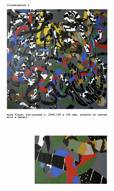
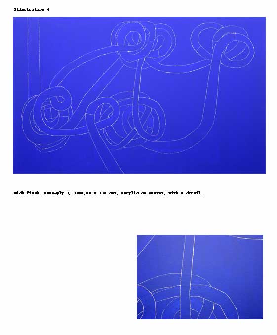
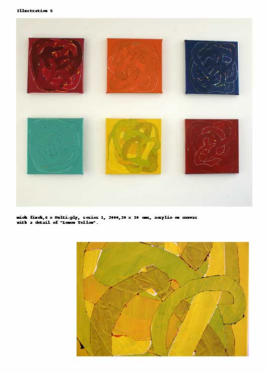
Ply-ground, Mono-ply, Multi-ply & Riposte
After Closer Than You Think my work went through
a phase where the ideas discussed in the last section were
the general background for a strategy to make three related
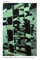
series of works. Ply-ground,
1998 – 2000 (see illustration 3),

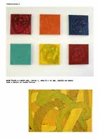
Mono-ply,
2000 – 2002 (see illustration 4)
and Multi-ply,
2000 – present (see illustration 5)
used a technical
development that occurred during Closer Than You Think
where I started to use masking tape. I found that a small
vestige of paint leaked under the masking tape and that this
could be active as a way of ‘re-grounding’ sections
of a painting. In the Ply-ground paintings the Mickey
Mouse, camouflage and paint drip systems were inscribed into
different linear networks weaving over and under each other.
The first of these paintings had a black ground and the line
networks were masked up with a first coat of white paint followed
by black and then over-layed with a motif. When the tape was
removed there would be the vestige of white paint around the
entire line network. In Mono-ply this same process
was applied but without the motifs. The sense here of each
network being re-grounded into the painting was fore-grounded
here. The Mono-ply paintings were monochromes in
all except the white halo around each line network signalling
the paintings primed undercoat. In Multi-ply the
paintings were made in series of six, each of the six paintings
having a different coloured ground. In each painting there
were five line networks, woven into each other. Each network
used a first coat of a colour from the other paintings in
the series, with the second colour the same as the painting’s
ground. The sense throughout these works has been to use the
painting’s materiality and construction to displace
the spectator into a series of readings. The principle here
is that of a kind of parallax effect most pronounced in the
Ply-ground series where each ground network would
have a different motif inscribed within it. In Multi-ply the
colour coding of each ground acted as a displacement between
the different paintings. These works were also made upon the
flatness/thickness critical axis and with Mono-ply
and Multi-ply the reductive aspect of painting as
monochrome was brought into question.
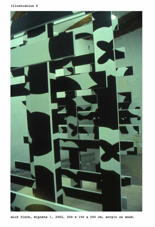
In Riposte
1 & 2 (see illustration 6)
this constructive
logic was applied as a three-dimensional form redeploying
the Mickey Mouse, camouflage and grid visual vocabulary of
Closer Than You Think. These four distinct series
of works lead directly to the work made since 2002 and generically
known as the Sublimey
paintings.
Sublimey
I began the black and white Sublimey series of paintings
in 2002 as a way of integrating several aspects of the Closer
Than You Think series and the Ply – paintings.
But I also sought to position it so that particular aesthetic
structures are material to the work’s reception. Like
Closer Than You Think, Sublimey uses modes
of representation where processes of painterly abstraction
offer culturally hegemonic forces for examination. In Closer
Than You Think, this was structured in relation to American
culture, Pop, Minimalism and a generally post war context.
In Sublimey the references and context is more European, and
most particularly British. A formal structuring of shapes
and images within the re-grounding process that was first
forwarded in the Ply-ground paintings is central
to the construction of these works. This diversification of
figure/ground motifs within one ’scene’ and within
the form of the painting as a tableaux links to the aim of
structuring the painting around parallax effects; a set of
shifting rhetorical and formal addresses that inhibit a totalised,
gestalt reading of the work. The European context here is
consolidated around an 18th century aesthetic debate between
the two extremes of the sublime and the beautiful. Uvedale
Price’s development of the picturesque as the midway
point between these two poles and even as a corrective to
their excesses has been an important touchstone for the Sublimey
series (16.). A number of processes and strategies have come
out of this. Firstly, as before, there is the process of inscription,
the ‘re-grounding’, through the use of masking
tape, of a distinct element in the pictorial regime. This
has the effect of looking like the shape or image has been
collaged into the painting. This effect of faux collage is
a way of articulating the scene as a set of distinct and discrete
disjunctions rather than as a seamless and synthesised space.
In addition painterly operations animate the space between
the virtual painting surface and its function as a support
for image and shape inscriptions. As in Closer Than You
Think this layers images into the surface of the painting;
playing between a discreet entity being readable and evident
or being subject to its environment or even seeming to be
formless material. The painterly aspect also reinforces the
painting’s status as a surface. It is flat and when
the surface is tilted so that the paint drips across the vertical
or horizontal axis it expresses its potential within an expanded
field of painting. The play between painterly strategies and
shape and image inscription establishes a kind of painterly
web or grid in which painterly events coincide, creating a
layered scene that operates within an order of visibility,
invisibility and effacement.
The process of image selection and transcription has also
become vital to the work. For the, most part, images are found
on the internet as low resolution files. After processing
in Photoshop, and schematising as black graphic images or
silhouettes they are printed out and projected onto the canvas
using an overhead projector. This process is both near and
far. I move from the aporia of the internet, the schematic
regime of the transcription to the physical proximity of the
canvas in the darkened studio. The near and far here are like
an inversion of a perspectival near, middle and far distance.
In addition this procurement of an image has something of
the readymade / found object about it. The re-transcription
involved here is a re-contextualisation of the image as an
object. It raises the kinds of questions and qualitative issues
often associated with collage.
The sampling and grabbing of images for Sublimey has become a process in itself. The different categories of
images have brought into play distinct pictorial mechanisms
that have been a result of the rhetorical qualities of the
images. Sublimey 3, 23 & 26 (see illustration
7) uses head forms, in this case the silhouette of a monarch,
Elizabeth II and two skull images.
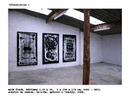
As images of heads
they both have iconic qualities, in the case of the monarch
the insidious panoptic gaze and with the skull, references
to mortality and vanitas. In each case the shift from the
image’s literal reference to a head and an iconic significance
are crucial in the material incorporation of the images into
the pictorial regime. The movement from the literal to the
iconic are echoed in the images being embedded in the tableaux;
the anthropomorphic scale and vertical orientation of the
canvas and the sense of the image passing within and across
the signatory field. In other works the lexical aspect has
determined the relationship between images and the painting’s
construction. Extinction and passing have been recurrent themes
for such images; dinosaurs and skeletons as well as obsolete
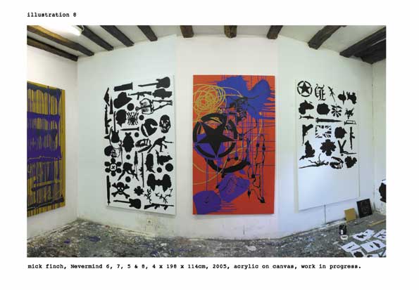
machines and objects. Some images, such as the Fender Stratocaster
guitar and the AK47 machine gun, evoke iconic associations
and have further, allegoric potential and have been the focus
of my current series of colour paintings that I have provisionally
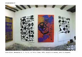
entitled Nevermind.
My intention from Closer Than You Think to Sublimey
and now to Nevermind
(see illustration 8), has been to position the spectator
within an active relationship to the paintings.
By locating the
image within a visual and pictorial rhetorical regime, the
tableau offers up its apparatus to the spectator in order
to give them a sense of the work working. To sum up, I see
the background I have laid out here as a sort of ethic of
making and representation. This regime does not mitigate the
demands of the daily practice of painting; the trial and error,
the accidents and intuition. not to mention the success or
failure of a work.
© text & images, Mick Finch, 2005.
Notes:
1. Michael Fried, Art
and Objecthood, University of Chicago Press, Chicago
and London, 1998. pp 33 – 40 also in Art
in Theory 1900-1990, Blackwell Oxford UK & Cambridge
USA.
2. Donald Judd, Specific Objects, in Judd, Complete
Writings, Halifax Nova Scotia,1975 also in Art
in Theory 1900-1990, Blackwell Oxford UK & Cambridge
USA.
3. Ibid.
4. Robert Morris, Notes on Sculpture 1-3, in Art
in Theory 1900-1990, Blackwell Oxford UK & Cambridge
USA.
5. Serge Guibaut, How
New York Stole the Idea of Modern Art: Abstract Expressionism,
Freedom and the Cold War,
Chicago, 1985.
6. Yve-Alain Bois, Painting
as Model, Cambridge USA, 1990, in Introduction: Resisting
Blackmail, pp xi – xxix.
7. Louis Althusser, Idéologie et Appareils Idéologiques
d’Etat, publiée dans La Pensée, Paris,1976,
pp 3-38. English version in Art
in Theory 1900-1990, Blackwell Oxford UK & Cambridge
USA pp 928-936.
8. Ibid.
9. I have discussed this and related issues in some of my
published writings, particularly: Painting
As Vigilance, Contemporary Visual Art Magazine (15),
London ; New
Technology, New Painting?, Contemporary Visual Art
Magazine (17), London and , Night
Shift, in a special edition on painting of Contemporary
Magazine (58), ' The Situation of Painting'. All these
texts can be found at http://www.mickfinch.com/texts.htm
10. Michael Fried, Art
and Objecthood, University of Chicago Press, Chicago
and London, 1998. pp 148 – 172.
11. Michael Fried. Absorption
and Theatricality: Painter and Beholder in the Age of Diderot,
Chicago,1980.
12. Ibid.
13. Yve-Alain Bois, Promenade pittoresque autour Clara-Clara
in the catalogue of an exhibition by Richard Serra, Centre
Georges Pompidou, Paris,1983. Also published in English as
A Picturesque Stroll Around Clara-Clara in October:
the first decade, 1976-1986 MIT press,1987
14. Ibid. Quotation by René-Louis de Giradin, De
la composition des paysage (1777), Editions du Champ
Urbain, 1979, p19.
15. Hubert Damisch, Fenêtre
jaune cadmium, Seuil Paris, 1984, pp99-120. Translation
by Mick Finch
16. Uvedale Price On
the Picturesque, 1794 Essay on the Picturesque, 1796-8
et 1801,